Cover Reveal Choice: MINE TO SPELL
Comments
19 responses to “Cover Reveal Choice: MINE TO SPELL”
-
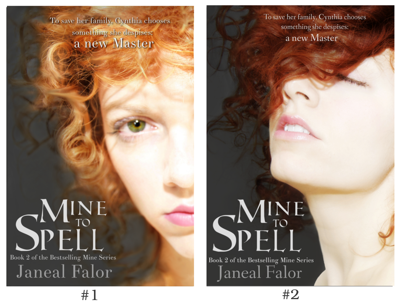
#2…she looks likes she’s longing for freedom. Great covers btw! It was hard to pick!
-

Both are gorgeous, but I prefer cover #1. I liked the intensity of the eyes on the cover of the first book and I think it is worth repeating.
-
#2 – I love the rich hair color, and the emotion in her face.
-
This is a hard decision. But I agree with Beth, I like cover #1. I love the eyes!
-
Both are great but I love #2 🙂
-
#2 fits more with “You Are Mine” – a sensual beautiful woman. #1 looks too much like girl-next-door and sulky altho her eyes are beautiful!
-
# 1 is my face. The eyes are what I love.
-
#2 i love that one
-
#2 Love the hair color and the movement.
-
#2 She looks like she just wants to get away.
-
I think I prefer #2! Something about the darker hair 🙂
-
I put your poll up on my blog at http://deborahjayauthor.com/2014/02/28/choose-a-cover-for-this-ya-fantasy-giveaway/
Unfortunately for some reason the poll won’t work there, but I have 3 votes now for #1, all with the same reasoning – that the first fits the description better even though the second is also gorgeous (please visit to see the comments).
Sorry to have to do this manually – not sure why the poll won’t work, but I’m not techie-minded enough to wrestle it into compliance.-
Thank you so much for posting the cover reveal and letting me know about the technical problem. I’ll definitely stop by your website in a couple days when I grab the final tally. Technology and I don’t always get along either, so no worries at all.
-
-
#2 looks awesome I’m voting for that one
-
Love the #2
-
Lol, will my vote count twice, since I did it on Facebook, too?
#2 is definitely more expressive of Cynthia’s personality. It’s just so carefree – a very different trait than Serena and her serious expression on the cover of You are Mine. I feel like #1 is too serious for Cynthia – I don’t get a lot of emotion from it.
You could even add a little bit of face paint to her neck to make it stand out more and be consistent with the story. Just thinking out loud of course.
-Sarah
-
Last call for votes! I’ll be adding up the totals in a few hours and posting the winner tomorrow.
-
#2
-
I love the cover. Thanks for sharing the process of finding the pictures and what they mean. Sorry I didn’t vote. This is the first day in quite a long time I’ve felt up to visiting blogs.

Comments?